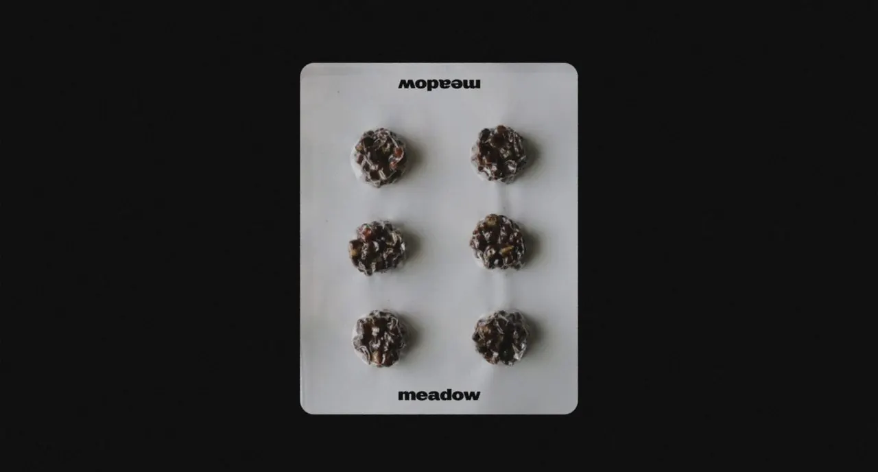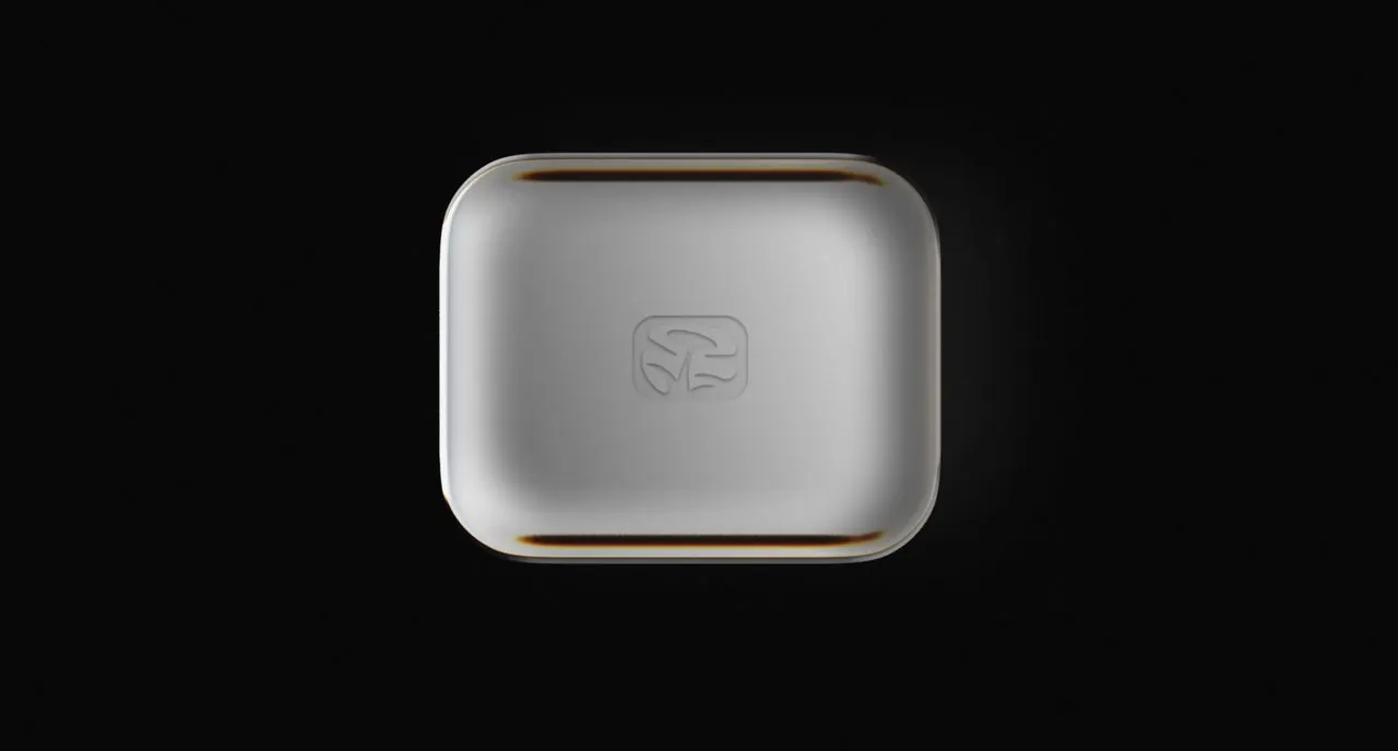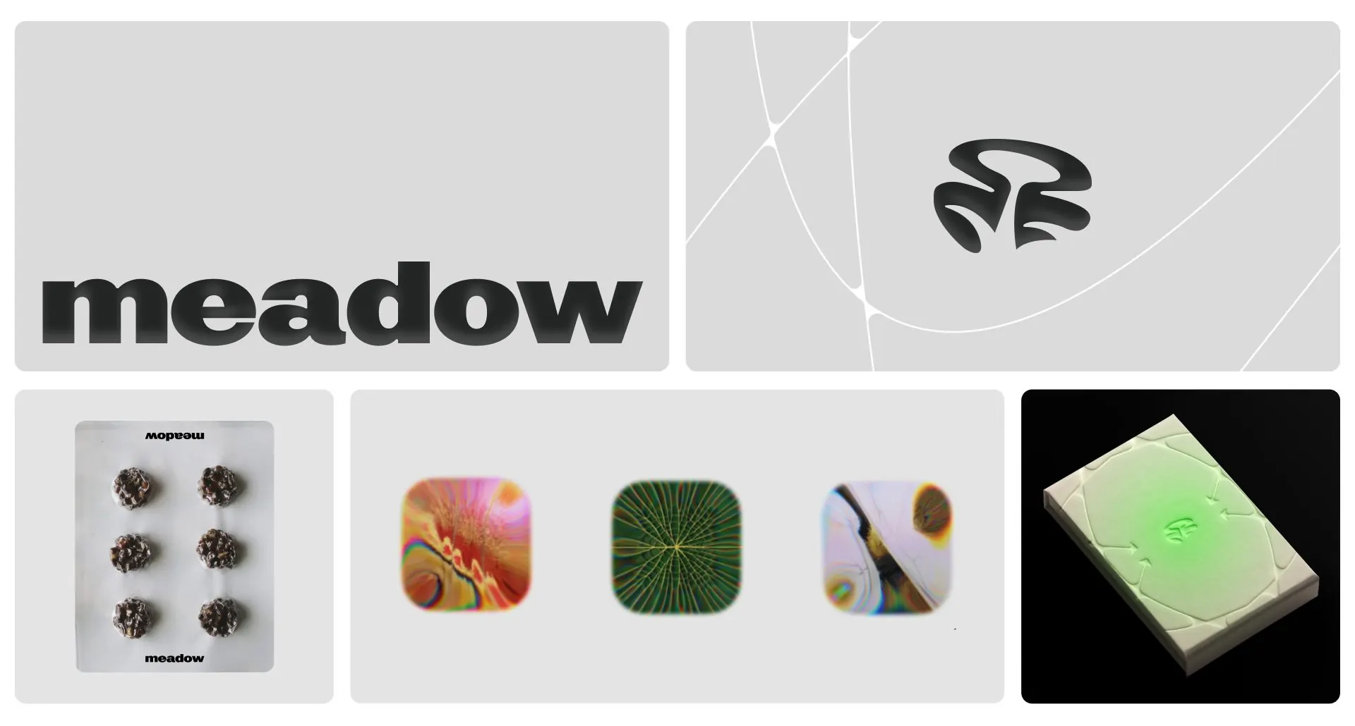
A calm, design-led wellness brand built around two kits, Micro and Macro.Meadow
- Client
- Meadow
- Industry
- Wellness, Consumer
- Services
- Brand Identity, Symbol System, Art Direction, Packaging, Social
- Year
- 2025
Meadow is a Lisbon-based brand bringing calm, science-informed microdosing to people across Europe. It’s built around two kits: Micro, for focus and clarity, and Macro, for perspective and reflection.
Most brands in this space feel either spiritual or clinical. Meadow wanted to be a gentle guide, not a guru, for design-minded people aged 25 to 40, and to become the most trusted name in Europe.
What we did
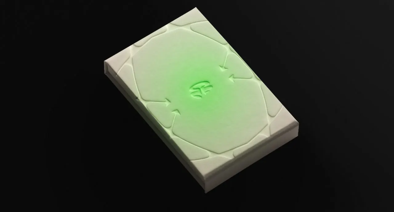
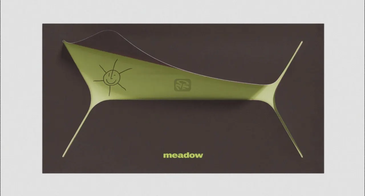
We built the identity around the idea of a meadow: calm and simple on the surface, with a huge network of roots and growth underneath. It shows up in the wordmark, the symbol and a fisheye photography style.
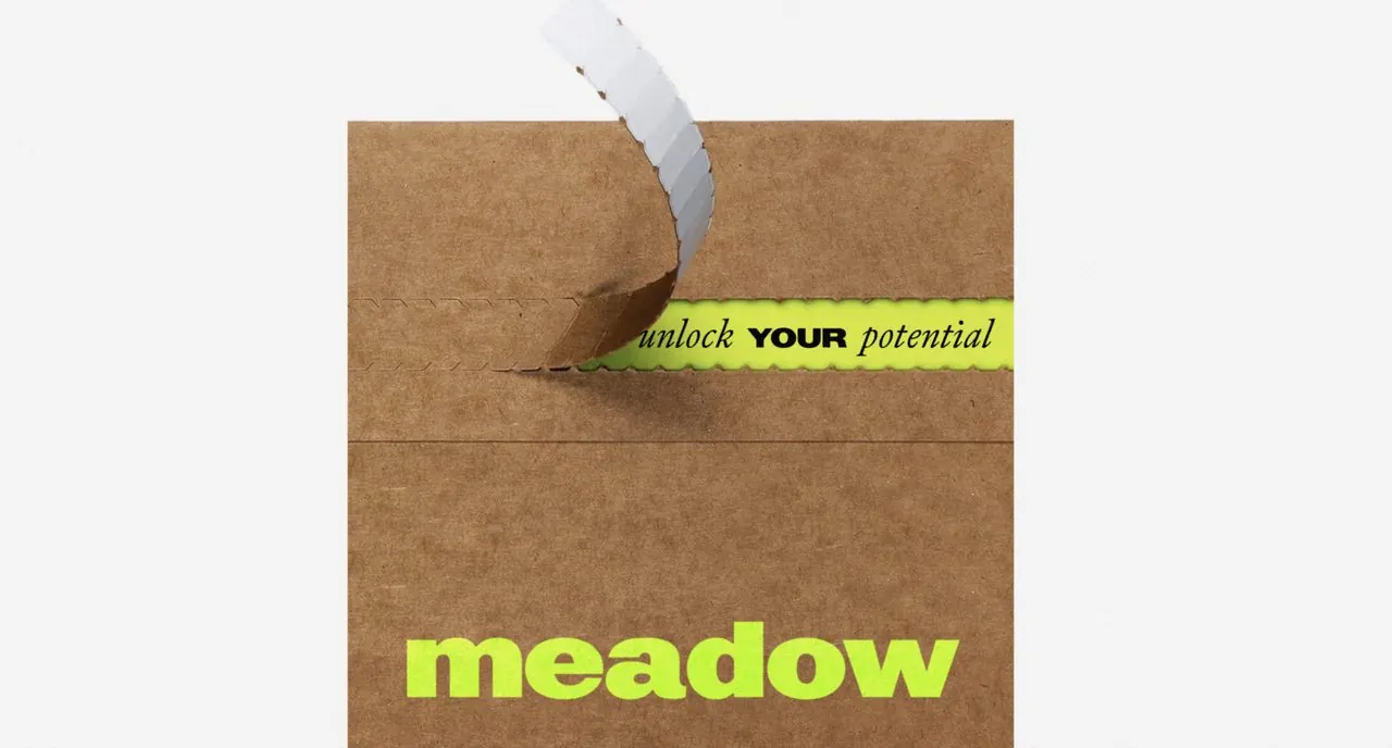
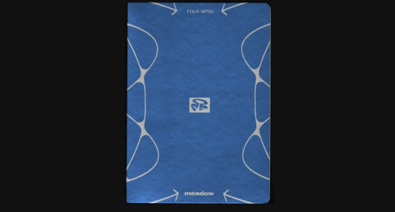
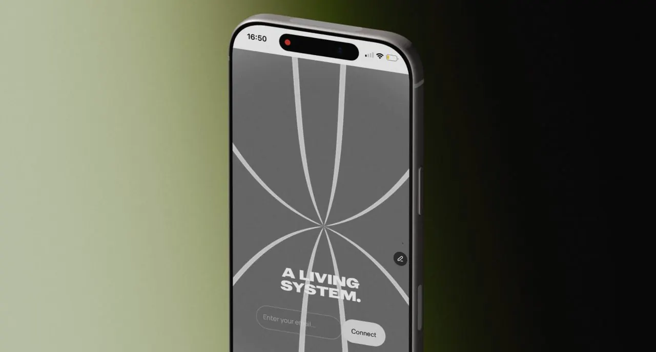
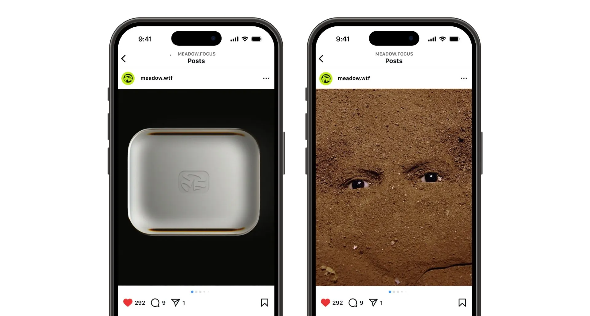
The system runs through the packs, sleeves, embossed boxes, mailers, notebooks, the app and social, so Meadow feels quietly confident from the first look to the product in your hand.